Craigslist:
A Mobile Redesign


Overview
Background
Over the course of about 4 weeks, I participated in redesigning the https:// newyork.craigslist.org mobile app. Consider user-goals, information hierarchy, legibility, and communicating the brand faithfully. The aim is not to reinvent or recreate the app but to keep the original purpose of the craigslist app. We aren’t updating features, but instead are improving usability, UI design and Service Experience through a quick few weeks of design sprints.
- Project Duration 09.28.22-11.03.22
- My Role Product and Visual Designer
-
Course
Digital Product Design with Christina
Latina - Tools Figma, Adobe Suite
So, What’s the Problem?

Self Customer
One of the most well know features of Craigslist is posting on their platform and meeting face to face. However, with the recent development of online marketplaces, Craigslist seems to have fallen behind. Many of these new C2C apps have combined both a marketplace and social network in which purchases can be made both online and in person. With consideration that Craigslist carries more than just the feature of customer to customer, I believe that increasing the usability grants higher and longer return on total investment over time.
The Current App
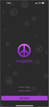
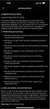

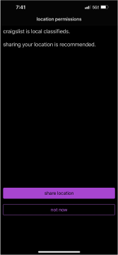
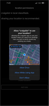
Extreme Difficulty in Navigating
For as long as I can remember, Craigslist has been the website to buy second hand items from. However, even while navigating the website, one of the hardest things to navigate throughout the website is the amount of information. Many, like me, rather opt to utilizing the search bar to find products and then contacting through the email. Similarly to the website, the mobile app mirrors this same issue. Text is extremely heavy and hierarchy inbalance encompases the entire app. Even from these first five pages, signing up becomes a difficult and tiresome task, that shoud be easy!
How did I get to the solution?
Audit/Learning
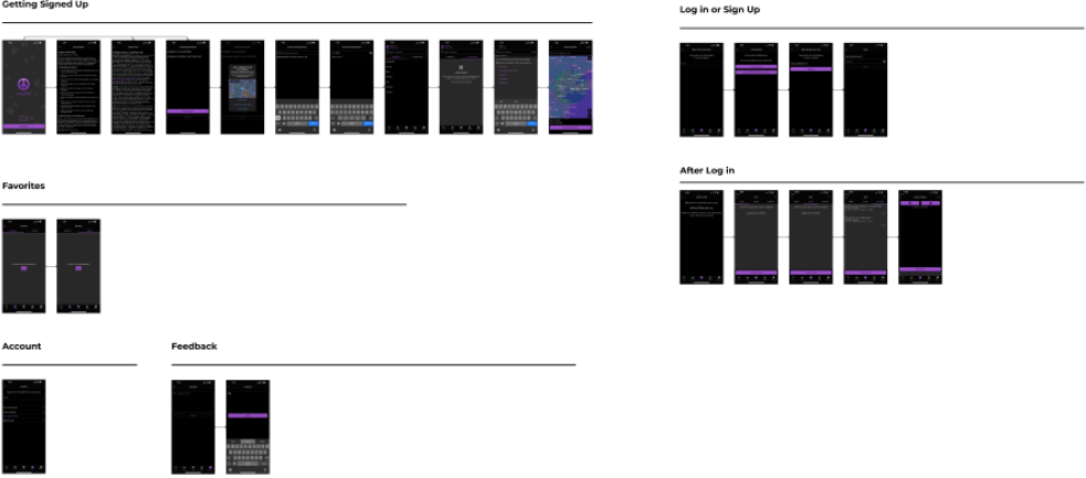
In order to further understand the current app, I first took the time to step into auditing the mobile application. Seperating each section help me break down all the possible loops and buttons in the app. In doing this, I was able to knitpick which section really needed to be improved and which section was already functioning well.
Creating Design System

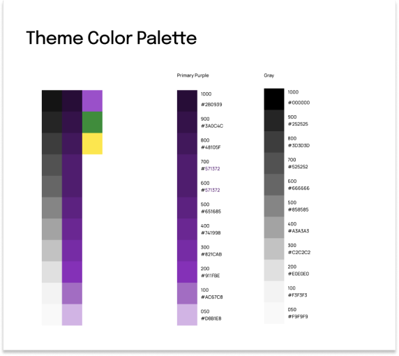

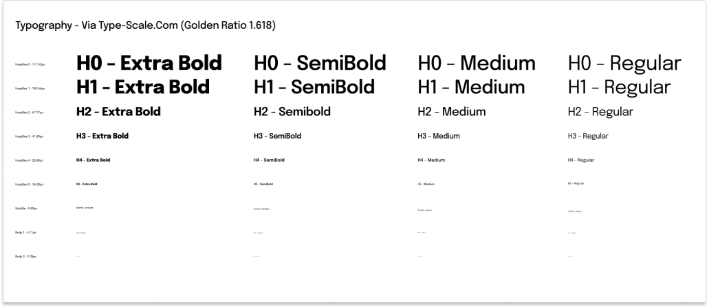
The next step was to creating a design guide composing of fonts, font sizing, color, component sets, and visual design sets. In order to stay keeping the previous craigslist on par, I opted to stick with the current color layout. I opted to create a gradient layout for the color system. As for the font sizing, I opted for the golden 1.1618 ratio.
Wireframing/Low Fidelity Modeling
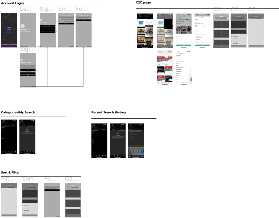
Next, after completing a full design system and implimenting all styles into figma, I was able to begin prototyping my product. I began brainstroming this part by separating account and info first. Followed by C2C page. Then categories and recent search history. Also, thinking about adding different features.
High Fidelity Modeling
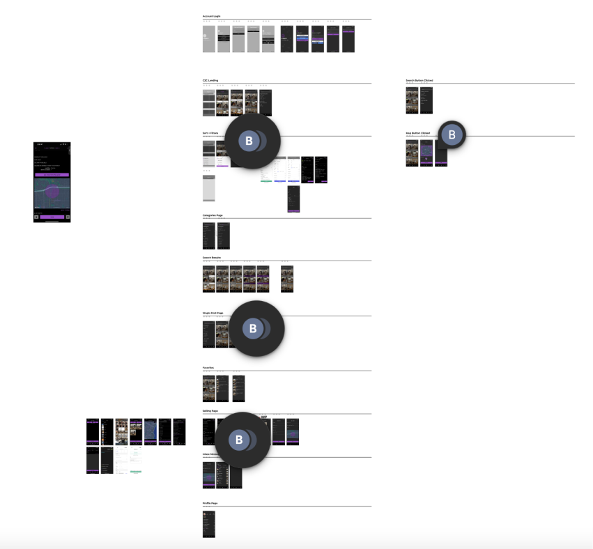
After completing sections of wireframing. I began implimenting my user interface style. Including color, font, font weight. A big thing to keep in mind in this step was to keep text hierarchy in check. In order to do this, I made sure to constantly refer back to the golden ratio and font text sizing style guided I had previous added.
Solution Showcase
Login Process
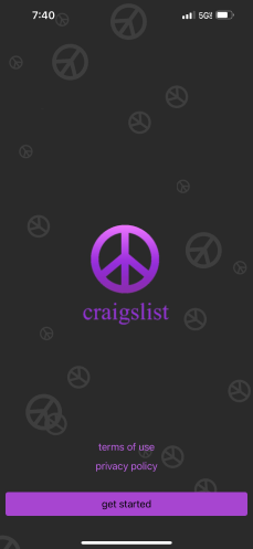
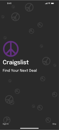
One of the big features that I implimented is a log in process. Because the current app doesn’t utilize a strong sign up process, it quickly reduces the need to want to continue navigating the app. A better onboarding process means for better user experience.
Landing Page
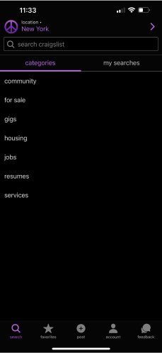
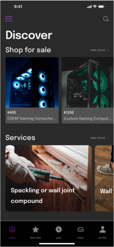
Another new feature, is providing a strong landing page. Previously, asssuming the developors and designer wanted to keep a strong relation to their website there was a lack of user experience. Large amounts of information created for an extremely complicated user experience.
Isolated Messages
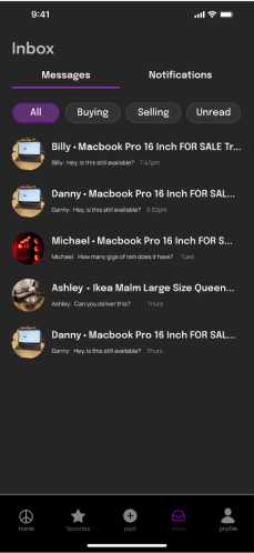
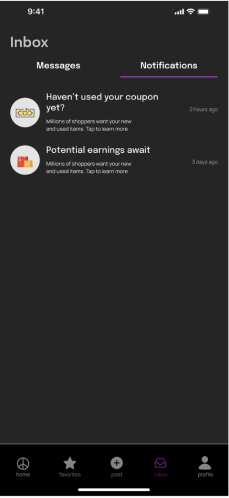
Another key feature to improve C2C experiene is adding a message system. In order to promote better customer interaction we increase interaction and overall sales. Additionally, I opted to add categories of all, buying, selling, and unread to better organize information.
